AQA GCSE Geography Paper 2Challenges in the Human Environment: every question, answered
We analysed every Paper 2 sitting AQA has set since 2020, including the actual questions students saw and the mark schemes examiners used. This paper always covers Section A (Urban issues and challenges), Section B (The changing economic world) and Section C (The challenge of resource management, where you answer Question 3 plus one option from Food, Water or Energy). June 2022 is the one genuine exception: AQA's own published Notice of changes confirms candidates that year answered Section A plus EITHER Section B OR Section C, not all three, with a shorter paper and different timing. Below is what each recurring question type has asked across the sittings we have, with a complete worked answer written to the mark scheme for each one, every paragraph explained.
Questions © AQA, quoted for analysis. Source materials described in our own words, not reproduced. Mark scheme content translated into plain English, not copied. PrepWise is independent and not endorsed by AQA.
The paper is a template
Same 11 question types, every sitting“Take the raw figures given in a table and calculate the mean, median or interquartile range, showing enough working to earn the method mark even if the final answer slips.”
A 2 mark statistical calculation recurs in June 2020, June 2022 and June 2023, always one mark for working and one for the final answer. June 2021 tested the same underlying skill (a range calculation and a percentage calculation) but only at 1 mark tariffs, so it is not included here as a like for like variant.
1×asked“Calculate the median life expectancy shown in Figure 8.”
“Calculate the median life expectancy shown in Figure 8.”
What it’s really asking
Order the life expectancy values given for each place along the railway line and find the true middle value.
What the sources actually showed — June 2020
A map showing life expectancy in years at eleven places along the East Coast mainline railway from Newcastle to London Kings Cross, each place shaded to show whether its life expectancy is below average, average or above the UK average.
| Place | Life expectancy (years) |
|---|---|
| Newcastle | 80 |
| Durham | 79.6 |
| Darlington | 80.4 |
| Northallerton | 81.9 |
| York | 81.5 |
| Doncaster | 79.6 |
| Newark | 81.3 |
| Grantham | 81.1 |
| Peterborough | 80.4 |
| Stevenage | 82.3 |
| London Kings Cross | 83.6 |
The full worked answer — June 2020
I order the eleven values from lowest to highest: 79.6, 79.6, 80.0, 80.4, 80.4, 81.1, 81.3, 81.5, 81.9, 82.3, 83.6. With eleven values the median is the sixth value in the ordered list, which is 81.1 years.
Could you have written this? Every fact in this answer is drilled in our quizzes — the writing is the easy part once the evidence is automatic.
Practise statistical calculation questionsWhat the mark scheme rewarded
- Correct working, ordering the values, for one mark, and the correct median value of 81.1 for the second mark
- The median life expectancy of 81.1 years along this railway line sits close to several of the more southerly stations, showing the north south pattern is not perfectly linear
Traps examiners saw
- Confusing the median with the mean and simply adding all values then dividing by eleven
- Miscounting which value is the true middle of an odd numbered list
Full-mark self-check 0 of 2
1×asked“Calculate the mean rate of growth per hour for the Asian cities shown in Figure 1. Answer to the nearest whole number.”
“Calculate the mean rate of growth per hour for the Asian cities shown in Figure 1. Answer to the nearest whole number.”
What it’s really asking
Identify which of the labelled cities on the world map are in Asia, add their growth rates and divide by how many Asian cities are shown.
What the sources actually showed — June 2022
A world map showing the rate of population growth for fourteen major cities, each labelled with a figure giving the number of extra people added per hour, colour coded by continent (Africa, Asia, Europe, North America, South America).
| City | Growth rate (people per hour) |
|---|---|
| Delhi | 79 |
| Shanghai | 53 |
| Dhaka | 74 |
| Mumbai | 51 |
| Jakarta | 27 |
| Manila | 29 |
The full worked answer — June 2022
Six of the fourteen labelled cities are shown in Asia: Delhi (+79), Shanghai (+53), Dhaka (+74), Mumbai (+51), Jakarta (+27) and Manila (+29). Adding these gives 313, and dividing by 6 gives a mean of 52 people per hour, to the nearest whole number.
Could you have written this? Every fact in this answer is drilled in our quizzes — the writing is the easy part once the evidence is automatic.
Practise statistical calculation questionsWhat the mark scheme rewarded
- Correctly identifying all six Asian cities and showing the addition, then the correct rounded mean of 52
- Asian megacities in this data grow far faster on average, 52 people per hour, than the HIC cities shown, such as London at +9 or Berlin at +1
Traps examiners saw
- Including a Middle Eastern or Oceania city coloured differently on the key by mistake
- Rounding to one decimal place instead of the nearest whole number the question asks for
Full-mark self-check 0 of 2
1×asked“Calculate the interquartile range for the data in Figure 8.”
“Calculate the interquartile range for the data in Figure 8.”
What it’s really asking
Order the seven countries' total debt figures, find the upper and lower quartile values, and subtract the lower from the upper.
What the sources actually showed — June 2023
A table showing the total debt, in millions of US dollars, of seven countries in 2019: Brazil, India, South Africa, Egypt, Peru, Bangladesh and Jordan.
| Country | Total debt (millions US$) |
|---|---|
| Brazil | 569398 |
| India | 560035 |
| South Africa | 188102 |
| Egypt | 115080 |
| Peru | 64204 |
| Bangladesh | 57088 |
| Jordan | 33683 |
The full worked answer — June 2023
Ordering the seven values from lowest to highest, the upper quartile is India's 560,035 and the lower quartile is Bangladesh's 57,088. Subtracting these gives an interquartile range of 502,947.
Could you have written this? Every fact in this answer is drilled in our quizzes — the writing is the easy part once the evidence is automatic.
Practise statistical calculation questionsWhat the mark scheme rewarded
- Correct identification of both the upper quartile of 560,035 and lower quartile of 57,088, then the correct subtraction of 502,947
- An interquartile range of over half a trillion US dollars shows how unevenly national debt is spread even among a small sample of LIC and NEE countries
Traps examiners saw
- Confusing the interquartile range with the simple range, highest minus lowest, which gives a different, larger figure
Full-mark self-check 0 of 2
The method for every Q02.8 / Q01.1 / Q02.8 — same every sittingMark bands, steps, timing
What this question type rewards
The topic changes by sitting — the mark scheme never does. Learn this once, then open your question above for that sitting’s sources and a full worked answer.
- Showing enough working to earn the method mark even if the final answer is wrong
- Applying the right technique, mean, median or interquartile range, to the right data set
The steps
- Identify exactly which numbers belong to the data set the question names
- For a mean, add every value and divide by the count of values
- For a median, order the values and find the true middle value, or average the middle two
- For an interquartile range, find the upper and lower quartile values first, then subtract
- Write the working down. Even simple working earns a mark independently of the final answer
What is the minimum population required for a city to be classified as a megacity?
Bring a calculator and practise these statistical calculations until the method is automatic. The working mark is available even when the final answer goes wrong.
Practise statistical calculation questions“Take a chart that is already mostly drawn and add the one missing bar or symbol using the value you are given.”
A 1 mark graph completion recurs in June 2020, June 2022 and June 2023. June 2021's own completion task existed too, but at a 2 mark tariff (an arrow diagram), so it is not included here as a like for like variant.
1×asked“Complete Figure 3 using the following data.”
“Complete Figure 3 using the following data.”
What it’s really asking
Use the pictogram key, where each symbol represents 10 percent of household waste recycled, to draw the correct number of symbols for Hull.
What the sources actually showed — June 2020
A pictogram showing the percentage of household waste recycled in 2016 to 2017 in eight UK cities, with a key stating each whole symbol represents 10 percent recycled.
| City | Percentage recycled |
|---|---|
| Hull | 50 |
The full worked answer — June 2020
I draw five complete symbols for Hull, since each symbol represents 10 percent and 50 percent divided by 10 gives exactly five whole symbols with none partially shaded.
Could you have written this? Every fact in this answer is drilled in our quizzes — the writing is the easy part once the evidence is automatic.
Practise graph and chart completion questionsWhat the mark scheme rewarded
- Exactly five complete symbols drawn for Hull, matching the pictogram's own key
- The pictogram key's scale of one symbol per 10 percent is the only fact needed for this mark
Traps examiners saw
- Drawing a part symbol when the value divides exactly, which is unnecessary and can look like an error
Full-mark self-check 0 of 1
1×asked“Complete Figure 4 using the following data.”
“Complete Figure 4 using the following data.”
What it’s really asking
Add one bar to a chart of UK urban areas' projected population growth rate, using the value given for Swindon.
What the sources actually showed — June 2022
A bar graph showing the 10 UK urban areas with the highest projected population growth rate, 2011 to 2036, with bars already drawn for nine of the ten areas including Luton, and one bar left blank for Swindon.
| City | Projected growth rate (%) |
|---|---|
| Swindon | 26.5 |
The full worked answer — June 2022
I draw the Swindon bar so its top reaches 26.5 percent, which sits 0.1 percentage points lower than the Luton bar immediately to its left on the chart.
Could you have written this? Every fact in this answer is drilled in our quizzes — the writing is the easy part once the evidence is automatic.
Practise graph and chart completion questionsWhat the mark scheme rewarded
- A bar reaching exactly 26.5 percent, correctly positioned relative to the neighbouring Luton bar
- The value given, 26.5 percent, is the only data needed for this mark
Traps examiners saw
- Drawing the bar level with or taller than Luton's bar by mistake, since the value is only slightly lower
Full-mark self-check 0 of 1
1×asked“Complete Figure 2 using the following data.”
“Complete Figure 2 using the following data.”
What it’s really asking
Add the missing bar to a chart of crimes reported on Twitter in Mexico City, using the value given for theft of motor vehicle.
What the sources actually showed — June 2023
A bar chart showing the number of reports, on a scale up to 1000, of five types of crime reported on Twitter in Mexico City between September 2016 and April 2017, with bars already drawn for street robbery, business burglary, card fraud and domestic burglary, and theft of motor vehicle left blank.
| Crime | Number of reports |
|---|---|
| Theft of motor vehicle | 350 |
The full worked answer — June 2023
I draw the theft of motor vehicle bar so its end reaches exactly 350 on the number of reports axis, matching the style of the other four bars already drawn.
Could you have written this? Every fact in this answer is drilled in our quizzes — the writing is the easy part once the evidence is automatic.
Practise graph and chart completion questionsWhat the mark scheme rewarded
- A bar reaching exactly 350 reports, width can be ignored and shading is not required
- The single value given in the question, 350 reports, is the only data needed for this mark
Traps examiners saw
- Misreading the axis scale, which runs in steps of 100 up to 1000, and placing the bar at the wrong gridline
Full-mark self-check 0 of 1
The method for every Q01.6 / Q01.6 / Q01.3 — same every sittingMark bands, steps, timing
What this question type rewards
The topic changes by sitting — the mark scheme never does. Learn this once, then open your question above for that sitting’s sources and a full worked answer.
- Plotting or shading the exact value given, in the correct position
- Matching the style of the bars, symbols or shading already on the chart
The steps
- Identify exactly which value you are adding, and to which bar, category or symbol row
- Check the scale or key before you plot
- Use a ruler for any straight bar edge
- Match the shading or symbol style already used on the rest of the chart
- Never guess a value that has not been given to you
What is the definition of urbanisation?
Bring a ruler and practise transferring given data onto a bar chart or pictogram accurately. This is a guaranteed easy mark almost every sitting.
Practise graph and chart completion questions“Look at a map or choropleth and describe the pattern it shows, naming real places or regions from the source, not just a vague impression.”
A short describe or compare the distribution question appears in every one of the four sittings we have, sometimes in Section A on an urban map and sometimes in Section C on a resource map.
1×asked“Describe the distribution of the countries which had 5 to 14.9% of their population undernourished between 2016 and 2018 as shown in Figure 11.”
“Describe the distribution of the countries which had 5 to 14.9% of their population undernourished between 2016 and 2018 as shown in Figure 11.”
What it’s really asking
Name the region where this middle band of undernourishment mostly sits, then add a named exception or second cluster.
What the sources actually showed — June 2020
A choropleth map of Africa showing the percentage of population undernourished between 2016 and 2018, shaded in five categories (25% or more, 15 to 24.9%, 5 to 14.9%, less than 5%, and no data for some countries).
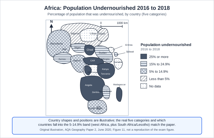
The full worked answer — June 2020
The majority of the 5 to 14.9% band countries are found in west Africa, forming two separate clusters there. Only South Africa and Lesotho, in the far south, fall into this band outside west Africa.
Could you have written this? Every fact in this answer is drilled in our quizzes — the writing is the easy part once the evidence is automatic.
Practise describing distributions on mapsWhat the mark scheme rewarded
- A basic statement that the majority sit in west Africa, developed with a second separate point about the southern outlier countries
- West Africa forms the main cluster of countries with moderate undernourishment, while South Africa and Lesotho form a separate, smaller cluster in the south
Traps examiners saw
- Describing only where undernourishment is highest, 25% or more, rather than the specific 5 to 14.9% band the question names
Full-mark self-check 0 of 1
1×asked“Describe the distribution of the cities shown in Figure 1.”
“Describe the distribution of the cities shown in Figure 1.”
What it’s really asking
Name the continent where most cities projected to become megacities by 2035 are found, then add a second, developed point.
What the sources actually showed — June 2021
A world map marked with cities expected to become megacities by 2035, positioned relative to the Tropic of Cancer, the Equator and the Tropic of Capricorn.
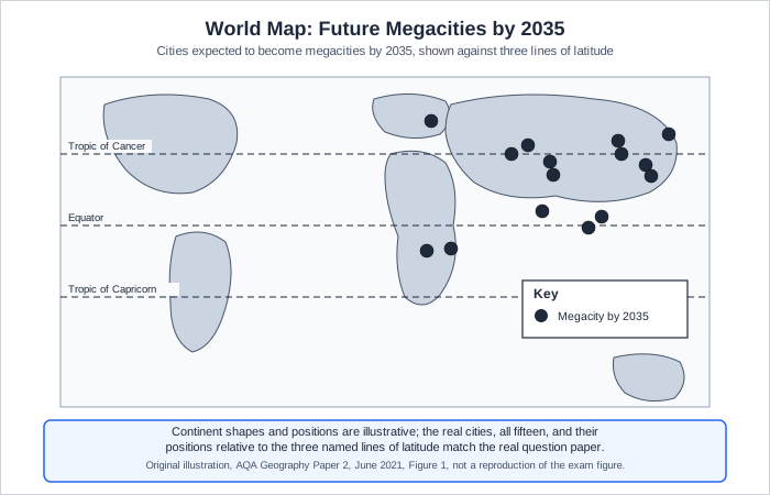
The full worked answer — June 2021
The majority of the cities are found in Asia, north of the Equator, including a dense cluster in and around China. There are no new megacities expected in the Americas, so this and Australasia are the only continents shown with none.
Could you have written this? Every fact in this answer is drilled in our quizzes — the writing is the easy part once the evidence is automatic.
Practise describing distributions on mapsWhat the mark scheme rewarded
- A basic statement that most are in Asia, developed with a second separate point about which continents have none
- A dense cluster of the cities projected to become megacities by 2035 lies in and around China, reflecting Asia's dominance of future urban growth
Traps examiners saw
- Explaining why these cities are growing rather than simply describing where they are located
Full-mark self-check 0 of 1
1×asked“Compare the distribution of the 10 highest and 10 lowest urban areas shown in Figure 5.”
“Compare the distribution of the 10 highest and 10 lowest urban areas shown in Figure 5.”
What it’s really asking
Compare where the fastest growing and slowest growing UK urban areas sit, naming a region or country pattern for each.
What the sources actually showed — June 2022
A UK map marking the 10 highest and 10 lowest urban areas for projected population growth rate 2011 to 2036, using two different symbols on the key.
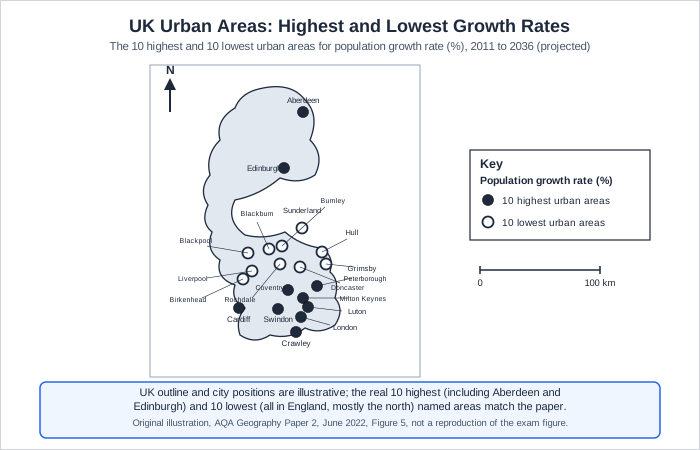
The full worked answer — June 2022
Most of the highest growing urban areas are in the south and east of the UK, while most of the lowest growing areas are further north. All ten of the lowest growing areas are in England, whereas three of the highest growing areas, including Aberdeen and Edinburgh, are outside England.
Could you have written this? Every fact in this answer is drilled in our quizzes — the writing is the easy part once the evidence is automatic.
Practise describing distributions on mapsWhat the mark scheme rewarded
- A basic north south comparison, developed with a second, named point about which areas are outside England
- Aberdeen and Edinburgh both feature among the ten highest growing urban areas despite being far to the north, showing the pattern is not a simple south equals growth rule
Traps examiners saw
- Only describing one of the two groups, highest or lowest, rather than comparing both as the question asks
Full-mark self-check 0 of 1
1×asked“Describe the distribution of countries which had a very low risk of water insecurity shown in Figure 14.”
“Describe the distribution of countries which had a very low risk of water insecurity shown in Figure 14.”
What it’s really asking
Name the region where very low risk countries are concentrated, then add a named exception.
What the sources actually showed — June 2023
A choropleth map of Africa showing the risk of water insecurity in 2019, shaded from very low to very high risk.
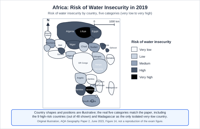
The full worked answer — June 2023
The largest area of very low risk countries stretches across central Africa towards the south. Madagascar is the only very low risk country that does not connect to this central belt, sitting isolated off the east coast.
Could you have written this? Every fact in this answer is drilled in our quizzes — the writing is the easy part once the evidence is automatic.
Practise describing distributions on mapsWhat the mark scheme rewarded
- A basic statement naming the central African belt, developed with a second point naming Madagascar as an isolated exception
- Madagascar sits apart from the main central African belt of very low risk countries, showing the pattern is not a single unbroken zone
Traps examiners saw
- Describing the high risk countries instead of the very low risk band the question specifically names
Full-mark self-check 0 of 1
The method for every Q04.2 / Q01.2 / Q01.8 / Q05.2 — same every sittingMark bands, steps, timing
What this question type rewards
The topic changes by sitting — the mark scheme never does. Learn this once, then open your question above for that sitting’s sources and a full worked answer.
- A general, accurate observation about the pattern
- A second point that develops it with a named place, region or comparison
The steps
- State the overall pattern in one sentence, using continent, region or country names
- Back it up with a second, more specific point, naming an exception or a named place
- Do not explain WHY the pattern exists, only describe WHAT it is
What is the minimum population required for a city to be classified as a megacity?
Always name a real place, region or exception when describing a distribution. A pattern stated without a named example caps at half marks.
Practise describing distributions on maps“Give a brief, accurate definition of a key term from the resource management topics, in one sentence.”
A 1 mark define a term question appears in the Food, Water or Energy option in June 2020, June 2021 and June 2023. June 2022 restructured Section C around scatter graphs and did not include this exact question type.
1×asked“What is meant by famine?”
“What is meant by famine?”
What it’s really asking
State the core meaning of famine as an extreme, widespread shortage of food.
The full worked answer — June 2020
Famine is a widespread shortage of food affecting a large number of people, often severe enough to cause starvation and death.
Could you have written this? Every fact in this answer is drilled in our quizzes — the writing is the easy part once the evidence is automatic.
Practise key term definitionsWhat the mark scheme rewarded
- A statement combining the idea of shortage with a large scale of people affected
- Famine is distinguished from ordinary food insecurity by the scale and severity of the shortage, often linked to conflict, drought or crop failure
Traps examiners saw
- Defining famine simply as 'not having food' without the idea of scale or severity, which the mark scheme will not credit alone
Full-mark self-check 0 of 1
1×asked“What is meant by water insecurity?”
“What is meant by water insecurity?”
What it’s really asking
State that water insecurity means people cannot reliably access clean, safe water.
The full worked answer — June 2021
Water insecurity means people do not have reliable access to enough clean, safe water to meet their daily needs.
Could you have written this? Every fact in this answer is drilled in our quizzes — the writing is the easy part once the evidence is automatic.
Practise key term definitionsWhat the mark scheme rewarded
- A statement combining lack of water with the idea of it needing to be clean, safe or accessible
- Water insecurity is not just about total volume, access, cleanliness and reliability all matter to whether a supply meets a population's needs
Traps examiners saw
- Confusing water insecurity with water deficit, which specifically means demand exceeding supply rather than access or quality
Full-mark self-check 0 of 1
1×asked“What is energy insecurity?”
“What is energy insecurity?”
What it’s really asking
State that energy insecurity means a country cannot reliably access enough affordable energy.
The full worked answer — June 2023
Energy insecurity means a country does not have a reliable supply of affordable energy to meet its needs.
Could you have written this? Every fact in this answer is drilled in our quizzes — the writing is the easy part once the evidence is automatic.
Practise key term definitionsWhat the mark scheme rewarded
- A statement combining lack of energy with the idea of it needing to be reliable or affordable
- Energy insecurity can affect even resource rich countries if political instability or infrastructure problems interrupt supply
Traps examiners saw
- Confusing energy insecurity with energy deficit, which specifically means demand exceeding supply
Full-mark self-check 0 of 1
The method for every Q04.4 / Q05.4 / Q06.3 — same every sittingMark bands, steps, timing
What this question type rewards
The topic changes by sitting — the mark scheme never does. Learn this once, then open your question above for that sitting’s sources and a full worked answer.
- A concise, accurate definition using the key idea (shortage, insecurity, lack of access)
The steps
- State the core idea in one short sentence
- Avoid re using the exact word being defined without adding meaning
Which of the following best defines food security?
Learn the precise one sentence definitions for every key resource management term before the exam. These are quick, guaranteed marks if the wording is accurate.
Practise key term definitions“Explain or assess an urban process or strategy, using a resource plus your own understanding, developing your points rather than just listing them.”
Every sitting includes a 6 mark, level marked question part way through Section A that tests an urban issue using a figure and your own understanding.
1×asked“Assess the importance of managing transport as part of urban sustainability.”
“Assess the importance of managing transport as part of urban sustainability.”
What it’s really asking
Judge how much managing transport contributes to a city becoming more sustainable, developing at least one transport strategy in depth.
The full worked answer — June 2020
Managing transport is central to urban sustainability, because congestion and vehicle emissions are among the biggest barriers to a city being liveable. Singapore's road pricing and quota schemes for car ownership are estimated to have cut traffic by around 45% and reduced accidents by around a quarter, showing that pricing people out of unnecessary car journeys genuinely changes behaviour rather than just adding infrastructure.
Reducing congestion in this way lowers nitrogen oxide emissions and improves air quality, which brings health benefits and makes a city more attractive to families who might otherwise move to the suburbs. Bristol's integrated transport system, linking buses, trains and cycle routes, shows the same principle can work through investment in alternatives rather than pricing alone, so managing transport well supports environmental, social and economic sustainability together rather than any one strand in isolation.
Could you have written this? Every fact in this answer is drilled in our quizzes — the writing is the easy part once the evidence is automatic.
Practise Section A explain and assess questionsWhat the mark scheme rewarded
- A well developed assessment of one or more transport strategies, showing how they contribute to environmental, social and economic sustainability
- Singapore's road pricing and car ownership quotas cut traffic by around 45% and accidents by around a quarter
- Bristol's integrated transport system links buses, trains and cycling to reduce car dependency
Traps examiners saw
- Listing several transport schemes by name without developing any of them, which caps the answer at a lower level
Full-mark self-check 0 of 2
1×asked“Suggest how urban sprawl and the growth of commuter settlements have impacts on the rural-urban fringe. Use Figure 3 and Figure 4 and your own understanding.”
“Suggest how urban sprawl and the growth of commuter settlements have impacts on the rural-urban fringe. Use Figure 3 and Figure 4 and your own understanding.”
What it’s really asking
Use the two Ordnance Survey maps of Aberdeen, one from the 1950s and one modern, to identify real changes on the rural-urban fringe and explain their impacts.
What the sources actually showed — June 2021
Two 1:50,000 Ordnance Survey maps of the same area on the edge of Aberdeen, Figure 3 showing the modern layout including a park and ride site, and Figure 4 showing the same area as it looked in the 1950s, before the modern housing and road network existed.
The full worked answer — June 2021
Comparing the two maps shows substantial new housing has been built on what was farmland to the west of Aberdeen in the 1950s map, along with an upgraded, dualled road running west to east that did not previously exist. This loss of green space at the fringe reduces habitat for wildlife and increases the amount of impermeable surface, which raises the risk of surface water flooding in the surrounding area.
The new park and ride site shown in the modern map also suggests the area now supports commuters travelling into Aberdeen, meaning residents get the benefit of cheaper, more accessible housing on the edge of the city, but the original village character is diluted as new estates come to dominate and local roads become busier with commuter traffic at peak times.
Could you have written this? Every fact in this answer is drilled in our quizzes — the writing is the easy part once the evidence is automatic.
Practise Section A explain and assess questionsWhat the mark scheme rewarded
- Use of both maps to identify a real change, developed with at least one clear environmental or social impact
- New housing on former farmland west of Aberdeen, an upgraded dual carriageway and a new park and ride site are all visible when comparing the 1950s and modern maps
Traps examiners saw
- Only describing differences between the two maps without explaining any impact, which the mark scheme explicitly caps at Level 1
Full-mark self-check 0 of 2
1×asked“Explain how urban planning is improving quality of life for the urban poor. Use Figure 2 and an LIC/NEE example you have studied.”
“Explain how urban planning is improving quality of life for the urban poor. Use Figure 2 and an LIC/NEE example you have studied.”
What it’s really asking
Use the newspaper extract on improving sub-Saharan African housing plus a named LIC/NEE scheme to explain how planning genuinely raises quality of life.
What the sources actually showed — June 2022
A newspaper extract reporting that housing quality in sub-Saharan Africa improved between 2000 and 2015, with the share of houses meeting good standards of space, water, sanitation and construction rising from 11% to 23%, while noting governments still need to invest more in infrastructure.
The full worked answer — June 2022
Figure 2 shows real progress, the share of houses in sub-Saharan Africa meeting good standards of space, water and sanitation roughly doubled from 11% to 23% between 2000 and 2015, but this still leaves the majority of housing below that standard, showing planning has improved conditions without yet transforming them.
In Rio de Janeiro's Favela Bairro scheme, poorly built houses were replaced with brick structures and residents were granted ownership rights, which removes the fear of eviction and the stress that comes with it. The scheme also added day care centres offering adult education classes, improving job prospects and giving families a more secure income, so quality of life improves through housing security and economic opportunity together, not housing alone.
Could you have written this? Every fact in this answer is drilled in our quizzes — the writing is the easy part once the evidence is automatic.
Practise Section A explain and assess questionsWhat the mark scheme rewarded
- Use of Figure 2's own statistics plus a named LIC/NEE example, developed with more than one distinct mechanism improving quality of life
- The share of sub-Saharan African housing meeting good standards rose from 11% to 23% between 2000 and 2015
- Rio's Favela Bairro scheme granted ownership rights and provided adult education alongside rebuilt housing
Traps examiners saw
- Naming a scheme without explaining how it improves quality of life, which caps the answer at a lower level
Full-mark self-check 0 of 2
1×asked“To what extent has urban growth created social opportunities? Use Figure 3 and a LIC/NEE example you have studied.”
“To what extent has urban growth created social opportunities? Use Figure 3 and a LIC/NEE example you have studied.”
What it’s really asking
Judge how far urban growth genuinely creates social opportunities such as education, using the volunteer street class photo plus a named LIC/NEE example.
What the sources actually showed — June 2023
A photograph of a small, informal street class in Mexico City, run by volunteers, showing children being taught outdoors rather than in a purpose built school.
The full worked answer — June 2023
Figure 3 shows that even informal, volunteer run classes provide children with schooling that would not otherwise be available, which is a genuine social opportunity, but the small, outdoor setting also shows this opportunity is limited in scale and quality compared with a properly resourced school.
In Dharavi, Mumbai, children can attend school where none existed in the rural areas many families migrated from, and a strong sense of community has developed within the settlement over time. However, only a limited number of children can access these opportunities at once, so while urban growth has clearly created social opportunities that did not exist before, the extent to which they reach the whole population remains limited by capacity.
Could you have written this? Every fact in this answer is drilled in our quizzes — the writing is the easy part once the evidence is automatic.
Practise Section A explain and assess questionsWhat the mark scheme rewarded
- Use of Figure 3 plus a named LIC/NEE example, developed with an explicit judgement of the extent of the opportunities created
- Children in Dharavi, Mumbai gain access to schooling and community life not available in the rural areas many families migrated from
Traps examiners saw
- Describing social opportunities without ever addressing the 'to what extent' command, which caps the answer below Level 3
Full-mark self-check 0 of 2
The method for every Q01.8 / Q01.7 / Q01.4 / Q01.6 — same every sittingMark bands, steps, timing
What this question type rewards
The topic changes by sitting — the mark scheme never does. Learn this once, then open your question above for that sitting’s sources and a full worked answer.
- Applying knowledge and understanding to the figure, not just describing it
- Developing at least one point with a named example or a clear reasoning chain
The steps
- Use the figure explicitly or through clear inference
- Bring in a named example if the question asks for one, this can cap the mark if missing
- Develop each point, explaining why it matters, not just naming it
- Keep to two or three tight points rather than a long list
What is the definition of urbanisation?
Develop one or two points in real depth with named examples rather than listing many schemes briefly. Depth beats breadth on this question every time.
Practise Section A explain and assess questions“Bring together detailed, precise knowledge of a named city with a reasoned judgement, always closing Section A and always the only question on the whole paper marked for SPaG.”
Every one of the four sittings ends Section A with a 9 mark, level marked question requiring a named city, plus 3 marks for spelling, punctuation, grammar and specialist terminology. This is the single most reliably tested question type on the whole paper.
1×asked“Suggest how a regeneration project can solve urban problems. Use Figure 5a and Figure 5b and a UK example you have studied.”
“Suggest how a regeneration project can solve urban problems. Use Figure 5a and Figure 5b and a UK example you have studied.”
What it’s really asking
Use the before and after photos at a marked point on the Hull OS map to identify what needed regenerating, then explain how a named UK regeneration scheme solves those problems.
What the sources actually showed — June 2020
An Ordnance Survey map of Hull with a point marked X, and two photographs taken at that point, one before and one after a regeneration scheme. The before photo shows a run down area with derelict looking warehouse units and little street activity. The after photo shows the same location repainted, with murals, new street lighting and businesses including food, drink and a gallery, with visibly more people of varying ages present.
The full worked answer — June 2020
Figures 5a and 5b show the scale of the original problem, derelict looking warehouses and an empty, unsafe feeling street, which the after photo shows transformed with repainting, murals, new lighting and a mix of food, drink and gallery businesses now bringing people of different ages back into the area. This is Hull's Fruit Market regeneration on Humber Street, an around eighty million pound scheme delivered by a partnership between Wykeland, Beal and Hull City Council.
The scheme solves urban problems by mixing housing with leisure and creative business use, which brings people back to live and spend time in an area that had lost its original economic purpose. The annual Humber Street Sesh festival, held in the same street, shows how the regeneration also creates a sense of community event and identity that the derelict warehouses could never have supported.
Overall, this regeneration solved urban problems by combining physical renewal with a genuine change of use and community activity, not visual improvement alone, which is why the area has sustained new business and footfall rather than reverting to decline.
Could you have written this? Every fact in this answer is drilled in our quizzes — the writing is the easy part once the evidence is automatic.
Practise the Section A 9 mark judgement questionWhat the mark scheme rewarded
- Precise named knowledge of the UK scheme beyond what the figures alone show, developed with more than one mechanism, reaching a considered conclusion
- Hull's Fruit Market regeneration on Humber Street cost around eighty million pounds and was delivered by Wykeland, Beal and Hull City Council
- The annual Humber Street Sesh festival shows the area now supports community events it could not have hosted before
Traps examiners saw
- Only describing the before and after photos without naming a real UK scheme, which the mark scheme caps at Level 2
Full-mark self-check 0 of 3
1×asked“Assess the extent of the challenges created by urban growth in LICs/NEEs. Use a case study of a city in an LIC/NEE.”
“Assess the extent of the challenges created by urban growth in LICs/NEEs. Use a case study of a city in an LIC/NEE.”
What it’s really asking
Judge how large or difficult the real challenges of rapid urban growth genuinely are in a named LIC/NEE city, reaching an explicit conclusion about the extent.
The full worked answer — June 2021
Lagos, Nigeria is growing by an estimated 600,000 people a year, and the city currently collects only around 40% of the waste it produces, showing infrastructure is failing to keep pace with population growth by a wide margin, not a small one.
Despite investment in a Bus Rapid Transit system and new expressways, many residents still face commutes of over two hours, showing that even genuine infrastructure investment has not yet solved the scale of the challenge. This suggests the problem is less a lack of effort by planners and more that population growth is outrunning what any single infrastructure scheme can deliver in the time available.
Overall, the challenges in Lagos are extensive rather than isolated, because the underlying driver, extremely rapid population growth, is outpacing waste collection and transport infrastructure at the same time rather than one at a time. This lands short of the very top mark because the evidence here covers two service areas in depth rather than a wider range, and does not weigh any way in which the challenges might be more limited.
Could you have written this? Every fact in this answer is drilled in our quizzes — the writing is the easy part once the evidence is automatic.
Practise the Section A 9 mark judgement questionWhat the mark scheme rewarded
- Precise named knowledge of the LIC/NEE city, developed across more than one challenge, reaching an explicit judgement about the extent of the challenges
- Lagos grows by an estimated 600,000 people a year and collects only around 40% of its waste
- Despite a Bus Rapid Transit system, many Lagos residents still face commutes of over two hours
Traps examiners saw
- Naming several challenges without ever judging their extent, which the mark scheme caps at Level 2
Full-mark self-check 0 of 3
1×asked“Assess the challenges created by urban change in a UK city you have studied.”
“Assess the challenges created by urban change in a UK city you have studied.”
What it’s really asking
Judge how serious the real challenges created by urban change are in a named UK city, using precise, dated evidence.
The full worked answer — June 2022
In Liverpool, deindustrialisation left large areas of poor quality housing that were slow to be redeveloped, so slow that some houses in the Granby Four Streets area were sold for just one pound each because they were in such poor condition. This shows the scale of housing dereliction is not a minor issue but one severe enough to make normal market sale impossible.
Unemployment in Anfield stood at around 9% of adults, higher than the UK average, showing that urban change from deindustrialisation created lasting economic as well as environmental challenges. The new Liverpool2 port development, intended to double capacity and create jobs, shows the city is responding, but such large infrastructure projects take years to translate into local employment, so the two challenges of dereliction and unemployment are linked rather than separate problems with separate solutions.
Overall, Liverpool's challenges from urban change are significant precisely because housing dereliction and unemployment reinforce each other, a derelict area attracts less investment and fewer jobs, which in turn leaves housing empty for longer, so tackling one in isolation is unlikely to be enough.
Could you have written this? Every fact in this answer is drilled in our quizzes — the writing is the easy part once the evidence is automatic.
Practise the Section A 9 mark judgement questionWhat the mark scheme rewarded
- Precise named knowledge of the UK city, developed across more than one challenge, with an explicit assessment of how serious and connected the challenges are
- Houses in Liverpool's Granby Four Streets area were sold for just one pound each due to their poor condition
- Unemployment in Anfield, Liverpool stood at around 9% of adults
Traps examiners saw
- Naming a UK city without any precise statistics, which caps the answer at a lower level even with good structure
Full-mark self-check 0 of 3
1×asked“'Urban change in the UK has created more economic opportunities than social opportunities.' Evaluate this statement. Use a UK city you have studied.”
“'Urban change in the UK has created more economic opportunities than social opportunities.' Evaluate this statement. Use a UK city you have studied.”
What it’s really asking
Weigh up whether economic opportunities genuinely outweigh social opportunities in a named UK city, reaching an explicit judgement either way.
The full worked answer — June 2023
Birmingham has developed real economic opportunities, hosting the largest number of businesses of any UK city outside London across a wide range of sectors. This gives Birmingham a genuinely broad economic base rather than dependence on a single industry.
Social opportunities have also grown, the Balti Triangle area reflects the cultural enrichment and diversity that has come with migration into the city, offering a distinctive social and leisure experience not available in most other UK cities. However, this kind of cultural and leisure opportunity mainly benefits those with disposable income to spend on it, whereas the economic opportunities from new businesses create jobs and income that reach a wider cross section of residents directly.
On balance, economic opportunities in Birmingham are more far reaching, because employment and business growth affect income directly for a broad range of residents, although not evenly. Younger and more skilled workers have gained the most from the new roles, while some residents in Birmingham's older manufacturing industries have lost out as the economy has changed. Social opportunities, though real, depend more on residents already having the money and time to enjoy them. Taken together, I agree that economic opportunities have had the greater overall impact, even though that impact itself is not shared equally across the city.
Could you have written this? Every fact in this answer is drilled in our quizzes — the writing is the easy part once the evidence is automatic.
Practise the Section A 9 mark judgement questionWhat the mark scheme rewarded
- Precise named knowledge of both economic and social opportunities in the named city, with an explicit, argued judgement of their relative merit
- Birmingham has the largest number of businesses of any UK city outside London, across a variety of sectors
- The Balti Triangle reflects the cultural diversity that has developed in Birmingham through migration
Traps examiners saw
- Describing economic and social opportunities without ever comparing their relative merit, which the mark scheme caps at Level 2
Full-mark self-check 0 of 3
The method for every Q01.11 / Q01.11 / Q01.10 / Q01.11 — same every sittingMark bands, steps, timing
What this question type rewards
The topic changes by sitting — the mark scheme never does. Learn this once, then open your question above for that sitting’s sources and a full worked answer.
- Precise, named knowledge of a real city (not a generic example)
- A considered analysis or judgement with an explicit conclusion
- Accurate spelling, punctuation and use of specialist geographical terms
The steps
- Name your case study city in the box provided, this is required for the higher levels
- Bring in precise, real statistics or named schemes, not generic statements
- Address the actual command word (suggest, assess, evaluate) with an explicit judgement, not just description
- Proofread the final two minutes for spelling, punctuation and specialist terms, this alone is worth 3 marks
What is the correct definition of a brownfield site?
Prepare precise, dated facts for at least one UK city and one LIC/NEE city before the exam, and always close with an explicit judgement that answers the command word directly.
Practise the Section A 9 mark judgement question“Weigh up a statement or strategy using resource evidence and your own understanding, reaching a view rather than only listing points.”
Every sitting includes a mid Section B, level marked judgement question worth 6 marks, most often phrased as 'do you agree' or 'to what extent'.
1×asked“Tourism is an effective way of reducing the development gap. Do you agree? Use Figure 7a and Figure 7b and an example you have studied to explain your answer.”
“Tourism is an effective way of reducing the development gap. Do you agree? Use Figure 7a and Figure 7b and an example you have studied to explain your answer.”
What it’s really asking
Judge how effective tourism genuinely is at closing the development gap, using the South Africa tourism graph and opinions plus a named country example.
What the sources actually showed — June 2020
Figure 7a is a bar graph showing tourist arrivals to South Africa rising from 14 million in 2012 to a projected 20 million by 2023. Figure 7b gives four short quoted opinions about tourism in South Africa: a UN habitat spokesperson praising conservation benefits, a local farmer complaining protected elephants damage crops, a government minister praising infrastructure development, a local resident noting only low skilled driver or waiter jobs are available, and a World Bank official noting the value of foreign currency.
The full worked answer — June 2020
I partly agree. Kenya earns around 12% of its GNP from tourism and the sector directly and indirectly employs around 600,000 people, so tourism clearly brings in significant foreign currency and jobs that support development, as the World Bank official's comment on foreign currency in Figure 7b also suggests.
However, Figure 7b's local resident notes that most available jobs are low skilled, such as driving or waiting tables, and much of the money tourists spend can be lost in leakage to foreign owned tour operators and airlines rather than reaching the local economy. This suggests tourism increases the appearance of growth in arrivals without guaranteeing that the underlying income actually closes the development gap for most residents.
Could you have written this? Every fact in this answer is drilled in our quizzes — the writing is the easy part once the evidence is automatic.
Practise Section B judgement questionsWhat the mark scheme rewarded
- A judgement developed with a named country example beyond the figure, weighing genuine benefits against leakage and low skilled employment
- Kenya earns around 12% of its GNP from tourism and the sector employs around 600,000 people directly and indirectly
- Much tourist spending can be lost in leakage to foreign owned tour operators rather than reaching local communities
Traps examiners saw
- Only describing Figure 7a's rising trend without ever addressing 'do you agree', which the mark scheme will not credit above Level 1
Full-mark self-check 0 of 2
1×asked“'Aid is the best way to reduce the development gap.' To what extent do you agree? Use Figure 8 and your own understanding.”
“'Aid is the best way to reduce the development gap.' To what extent do you agree? Use Figure 8 and your own understanding.”
What it’s really asking
Judge how far aid, compared with at least one other strategy, is genuinely the best way to reduce the development gap.
What the sources actually showed — June 2021
A factfile about Asha, a charity aid project working with the urban poor in Delhi, stating it has benefited around 700,000 people in 91 slums, receives funding from several governments and charities, gives slum residents access to bank loans at good rates with 99% repaid on time, and runs resource centres offering computer and English classes.
The full worked answer — June 2021
Asha's approach, shown in Figure 8, targets people directly, its microfinance loans reach around 700,000 people across 91 slums with a 99% repayment rate, which suggests aid delivered at this bottom up, community level can genuinely reach people that larger national schemes might miss.
However, aid is not automatically the best strategy compared with alternatives such as Fairtrade, which secures a guaranteed price for farmers' produce without depending on continued donor goodwill the way charity funded aid does. Asha itself depends on a mix of government and charity funders, so its long term future is less secure than a trade based strategy that generates its own ongoing income, meaning aid may work well at a local scale but is not necessarily the best strategy overall for closing the development gap.
Could you have written this? Every fact in this answer is drilled in our quizzes — the writing is the easy part once the evidence is automatic.
Practise Section B judgement questionsWhat the mark scheme rewarded
- Use of Figure 8's own precise statistics, compared against at least one genuinely different strategy, reaching an extent based judgement
- Asha's microfinance scheme benefits around 700,000 people across 91 Delhi slums, with a 99% loan repayment rate
- Fairtrade secures a guaranteed price for farmers without depending on continued donor funding
Traps examiners saw
- Discussing only aid without comparing it to at least one other strategy, which the mark scheme caps at Level 2
Full-mark self-check 0 of 3
1×asked“'Transnational corporations (TNCs) bring more disadvantages than advantages to a host country.' Do you agree? Explain your answer.”
“'Transnational corporations (TNCs) bring more disadvantages than advantages to a host country.' Do you agree? Explain your answer.”
What it’s really asking
Judge, using a named TNC in a named LIC/NEE, whether disadvantages genuinely outweigh advantages, reaching an explicit conclusion.
The full worked answer — June 2022
Shell directly employs around 65,000 people in Nigeria and a further 250,000 indirectly, with 91% of its contracts going to Nigerian companies, which shows the advantages are substantial and reach well beyond direct staff into the wider Nigerian business community.
However, oil spills in the Bodo region have damaged fishermen's livelihoods and continued gas flaring adds to greenhouse gas emissions, while resentment over oil wealth has helped fuel armed groups such as the Niger Delta Avengers, showing the disadvantages are not minor side effects but ongoing sources of economic and social harm for the communities living closest to the operations.
On balance, I disagree that TNCs bring more disadvantages than advantages here, because Shell's jobs and contracts reach a wide cross section of the Nigerian economy every year, while the environmental and security harms, though real and serious, fall mainly on specific communities in the Niger Delta rather than the country as a whole.
Could you have written this? Every fact in this answer is drilled in our quizzes — the writing is the easy part once the evidence is automatic.
Practise Section B judgement questionsWhat the mark scheme rewarded
- A named TNC in a named LIC/NEE, with precise advantages and disadvantages weighed against each other, reaching a conclusion
- Shell directly employs around 65,000 people in Nigeria, with 91% of contracts going to Nigerian companies
- Oil spills in the Bodo region have damaged fishermen's livelihoods and fuelled conflict
Traps examiners saw
- Listing only advantages or only disadvantages, which the mark scheme caps if no conclusion weighing both is reached
Full-mark self-check 0 of 3
1×asked“To what extent are modern industrial developments environmentally sustainable? Use Figure 6 and your own understanding.”
“To what extent are modern industrial developments environmentally sustainable? Use Figure 6 and your own understanding.”
What it’s really asking
Judge how far a modern industrial development like Southampton Science Park is genuinely environmentally sustainable, weighing its green features against its limitations.
What the sources actually showed — June 2023
A factfile about the Southampton Science Park, describing high quality office and laboratory facilities in a healthy environment, 72 acres of green space including lakes and walking routes, 27 acres of protected conservation area, and a commitment to minimising waste and improving energy efficiency.
The full worked answer — June 2023
The Southampton Science Park shows real environmental ambition, with 27 of its 72 acres protected as a conservation area and a stated commitment to minimising waste and improving energy efficiency, which goes well beyond older industrial estates that were built with little regard for green space or emissions.
However, building the science park still required removing existing trees and green space to create the site in the first place, and a development of this scale will generate significant car based commuting, adding to congestion and air pollution even if the buildings themselves are efficient. This suggests modern industrial developments are more sustainable than in the past but are not fully sustainable, since the process of building and using them still creates environmental costs the green branding does not remove.
Could you have written this? Every fact in this answer is drilled in our quizzes — the writing is the easy part once the evidence is automatic.
Practise Section B judgement questionsWhat the mark scheme rewarded
- Use of Figure 6's own precise statistics, weighed against a genuine limitation, reaching an extent based judgement
- 27 of the Southampton Science Park's 72 acres are protected conservation area
- Building the site required removing existing trees and green space
Traps examiners saw
- Only listing the green features shown in Figure 6 without ever questioning their limits, which caps the answer below Level 3
Full-mark self-check 0 of 3
The method for every Q02.7 / Q02.9 / Q02.11 / Q02.3 — same every sittingMark bands, steps, timing
What this question type rewards
The topic changes by sitting — the mark scheme never does. Learn this once, then open your question above for that sitting’s sources and a full worked answer.
- A view or judgement that is developed with evidence, not merely asserted
- Comparing the named strategy against at least one alternative where the question requires it
The steps
- State your view early, then support it with developed evidence
- Where the question asks for a comparison, credit is capped without at least one alternative considered
- Use the figure explicitly or through clear inference
- Reach a conclusion rather than trailing off after listing points
The Human Development Index (HDI) combines which three measures?
Always compare your named strategy or example against a genuine alternative where the question implies one. A one sided answer caps well below full marks.
Practise Section B judgement questions“Close Section B with detailed, named knowledge and a considered judgement, without the SPaG marks that Section A's closing question carries.”
June 2020, June 2021 and June 2023 all close Section B with a 9 mark, level marked judgement question. June 2022 replaced this with a 6 mark question instead, a genuine structural change confirmed by AQA's own Notice of changes for that series, so it is not included here as a like for like variant.
1×asked“Evaluate the success or likely success of one or more strategies to resolve regional differences in the UK.”
“Evaluate the success or likely success of one or more strategies to resolve regional differences in the UK.”
What it’s really asking
Judge how successful a named UK strategy, or strategies, genuinely is at closing the north south divide, using precise evidence.
The full worked answer — June 2020
The Humber Local Enterprise Partnership had, by 2019, secured around £532 million of investment, created nearly 6,000 jobs and supported over 13,000 businesses in an economically deprived region, showing a genuinely large scale of intervention rather than a small pilot scheme.
However, HS2, the other major strategy intended to boost the north through faster rail links to London, has become significantly over budget, and questions remain over whether the benefits will genuinely reach the north or mostly benefit London and Birmingham through easier access to southern jobs. This suggests success varies considerably by strategy and scale, a smaller, locally targeted scheme like the Humber LEP shows measurable results, while a very large national infrastructure project carries more uncertainty over who actually benefits.
Overall, targeted, locally delivered strategies like the Humber LEP show clearer, more measurable success at resolving regional differences than very large national schemes like HS2, whose benefits are harder to guarantee will reach the areas that need them most.
Could you have written this? Every fact in this answer is drilled in our quizzes — the writing is the easy part once the evidence is automatic.
Practise Section B closing judgement questionsWhat the mark scheme rewarded
- Precise, named knowledge of at least one strategy, developed with genuine evaluation of who benefits, reaching a considered conclusion
- The Humber Local Enterprise Partnership secured around £532 million of investment and created nearly 6,000 jobs by 2019
- HS2 has become significantly over budget, raising questions over who genuinely benefits
Traps examiners saw
- Describing a strategy without evaluating its success, which the mark scheme caps at Level 1
Full-mark self-check 0 of 3
1×asked“Social and economic changes in the UK rural landscape are positive in an area of population growth, negative in an area of population decline. Do you agree? Justify your answer, using one or more examples.”
“Social and economic changes in the UK rural landscape are positive in an area of population growth, negative in an area of population decline. Do you agree? Justify your answer, using one or more examples.”
What it’s really asking
Judge whether growth is always straightforwardly positive and decline always straightforwardly negative in the UK rural landscape, using named areas of each.
The full worked answer — June 2021
In commuter villages within reach of Cambridge, population growth has brought new housing and business opportunities as more affluent residents move in, but house prices have also risen enough to price out many existing local families, and roads and school places have become increasingly congested at peak times.
In declining areas of rural Cumbria, shops and schools have closed as populations fall and age, which clearly harms the immediate services available, but a strong sense of community has often developed as remaining residents work harder to keep local life going, and villages have avoided the identikit new housing estates that have changed the character of many growth areas elsewhere.
I do not fully agree with the statement, growth areas gain economically but lose some social cohesion and affordability, while decline areas lose services but can gain community identity, so the real picture in both types of area is a mix of gains and losses rather than a simple positive versus negative divide.
Could you have written this? Every fact in this answer is drilled in our quizzes — the writing is the easy part once the evidence is automatic.
Practise Section B closing judgement questionsWhat the mark scheme rewarded
- Named examples of both growth and decline, with genuine positives and negatives identified in each, reaching a considered judgement about the statement
- Commuter villages near Cambridge have seen rising house prices alongside new housing supply
- Declining rural areas in Cumbria have lost services but often retain strong community spirit and unspoilt character
Traps examiners saw
- Treating growth as automatically positive and decline as automatically negative without a genuine counterpoint, which the mark scheme caps at Level 2
Full-mark self-check 0 of 3
1×asked“Suggest how economic development can bring improvements to quality of life but at a cost to the environment. Use a case study of a LIC/NEE in your answer.”
“Suggest how economic development can bring improvements to quality of life but at a cost to the environment. Use a case study of a LIC/NEE in your answer.”
What it’s really asking
Link a real LIC/NEE development to genuine quality of life improvements while also showing a genuine environmental cost, connecting the two rather than listing them separately.
The full worked answer — June 2023
Unilever employs around 16,000 people in India, and its Project Shakti scheme gives around 45,000 poor rural women an income opportunity selling Unilever products, which research suggests has a bigger impact on whole family quality of life than an equivalent income gained by men. Unilever's operations have also helped extend sanitation access to around 115 million people in India, directly improving health and quality of life.
However, this same economic development has environmental costs, a mercury spill at Kodaikanal contaminated the surrounding area, showing that a lack of attention to safety in the pursuit of production can cause lasting environmental damage. This directly links the two sides of the statement, the same drive for growth that funds sanitation and income schemes also created the conditions for the contamination, rather than the benefits and costs being unrelated events.
The scale of this contrast is also worth noting, the contamination at Kodaikanal was concentrated on one site and its surrounding community, while the jobs, Project Shakti income and sanitation improvements described above reach many more people right across India. This shows the same TNC operations can deliver widespread benefits and serious, localised harm at the same time, rather than one cancelling out the other.
Could you have written this? Every fact in this answer is drilled in our quizzes — the writing is the easy part once the evidence is automatic.
Practise Section B closing judgement questionsWhat the mark scheme rewarded
- A named LIC/NEE example with precise quality of life benefits AND a genuine environmental cost, explicitly linked to the same underlying development
- Unilever's Project Shakti gives around 45,000 rural women in India an income opportunity
- A mercury spill at Unilever's former factory in Kodaikanal, India contaminated the surrounding area
Traps examiners saw
- Describing a benefit and a cost as two unconnected facts rather than linking them, which the mark scheme caps at Level 2
Full-mark self-check 0 of 3
The method for every Q02.10 / Q02.10 / Q02.10 — same every sittingMark bands, steps, timing
What this question type rewards
The topic changes by sitting — the mark scheme never does. Learn this once, then open your question above for that sitting’s sources and a full worked answer.
- Detailed, precise knowledge of the named place or strategy
- A considered conclusion reached through analysis, not asserted
The steps
- Name the place, area or example required
- Use precise, dated statistics rather than generic claims
- Reach an explicit conclusion that directly answers the question set
Which economic sector makes up approximately 80% of the UK's economy today?
This question carries no SPaG credit, so every one of the 9 marks depends purely on your geography. Prepare precise, named facts and always reach an explicit conclusion.
Practise Section B closing judgement questions“Explain a quoted statement using specific evidence drawn from two given sources, rather than general knowledge alone.”
Every one of the four sittings closes Question 3, the compulsory opening question of Section C, with this same 6 mark, level marked question, always requiring evidence from two named figures.
1×asked“'There are economic and environmental issues associated with the exploitation of energy sources.' Use evidence from Figure 10a and Figure 10b to explain this statement.”
“'There are economic and environmental issues associated with the exploitation of energy sources.' Use evidence from Figure 10a and Figure 10b to explain this statement.”
What it’s really asking
Use the cost graph and the wind farm photo to show a genuine economic dilemma and a genuine environmental issue in energy exploitation.
What the sources actually showed — June 2020
Figure 10a is a bar chart showing the cost in pounds per megawatt hour of generating electricity in the UK from coal, gas, onshore wind and offshore wind, with offshore wind shown as the cheapest by a clear margin and onshore wind also notably cheaper than coal and gas, though not by as much. Figure 10b is a photograph showing a protest sign objecting to a new onshore wind turbine, with an offshore wind farm visible further out at sea in the background.
The full worked answer — June 2020
Figure 10a shows offshore wind is the cheapest source of electricity shown, at around £50 per megawatt hour, roughly half the cost of coal or gas at around £90. Onshore wind, at around £81, is also cheaper than fossil fuels but by a much smaller margin. This creates an economic dilemma, because Figure 10b shows a protest sign objecting to a new onshore turbine's landscape impact, meaning even the less economically attractive of the two wind options still provokes strong local opposition, while the genuinely cheapest option, offshore wind, sits further out at sea and avoids this same objection.
There are also environmental issues beyond the visual impact shown in Figure 10b, since continuing to use coal and gas means ongoing greenhouse gas emissions despite their high cost, while both wind sources shown avoid this cost entirely. This shows the economic and environmental issues are connected rather than separate, fossil fuels are not just the most expensive sources shown, they also carry a long term environmental cost that neither wind option does.
Could you have written this? Every fact in this answer is drilled in our quizzes — the writing is the easy part once the evidence is automatic.
Practise Question 3's closing explain questionWhat the mark scheme rewarded
- Precise use of Figure 10a's cost data connected to Figure 10b's visual issue, developed with a second, distinct environmental point about emissions
- Offshore wind, at around £50 per megawatt hour, is roughly half the cost of coal or gas at around £90
- Figure 10b shows a protest against an onshore wind turbine, despite onshore wind still being cheaper than fossil fuels
Traps examiners saw
- Discussing only cost or only landscape impact without connecting the two, which the mark scheme caps at Level 2
Full-mark self-check 0 of 3
1×asked“'Growing concern in the UK about the carbon footprint of food creates both opportunities and challenges.' Use evidence from Figure 10a and Figure 10b to explain this statement.”
“'Growing concern in the UK about the carbon footprint of food creates both opportunities and challenges.' Use evidence from Figure 10a and Figure 10b to explain this statement.”
What it’s really asking
Use the CO2 by food type graph and the local food delivery service screenshot to show both a genuine challenge and a genuine opportunity created by carbon footprint concerns.
What the sources actually showed — June 2021
Figure 10a is a bar chart showing kilograms of CO2 emitted per kilogram of food produced for beef, lamb, farmed fish, pork, chicken and eggs, with beef and lamb producing by far the most emissions. Figure 10b is a screenshot of edible16, a not for profit online shopping service delivering locally produced food and drink around Market Harborough.
The full worked answer — June 2021
Figure 10a shows beef and lamb produce far more CO2 per kilogram than chicken or eggs, creating a genuine challenge, UK producers of beef and lamb face pressure to reduce emissions or lose customers as awareness grows, and farmers cannot simply switch livestock overnight without significant cost and disruption.
Figure 10b shows an opportunity created by the same concern, services like edible16 let customers order from several local producers in one delivery, reducing the transport emissions of buying food from many separate suppliers while still supporting local farmers' income. This shows the same growing concern that challenges high emission producers also creates a genuine new market opportunity for those able to supply lower carbon, local alternatives.
Could you have written this? Every fact in this answer is drilled in our quizzes — the writing is the easy part once the evidence is automatic.
Practise Question 3's closing explain questionWhat the mark scheme rewarded
- Precise use of Figure 10a's emissions data as a challenge, connected to Figure 10b's local delivery model as a genuine opportunity
- Beef and lamb produce far more CO2 per kilogram of food than chicken or eggs, according to Figure 10a
- edible16 consolidates orders from multiple local producers into one delivery, reducing transport emissions
Traps examiners saw
- Discussing only the challenge or only the opportunity, when the statement explicitly asks for both
Full-mark self-check 0 of 3
1×asked“Discuss the challenges of the changing demand for water in the UK. Use Figure 11 and your own understanding.”
“Discuss the challenges of the changing demand for water in the UK. Use Figure 11 and your own understanding.”
What it’s really asking
Use the headlines about rising appliance ownership and population concentration in the south to discuss a genuine challenge for UK water supply.
What the sources actually showed — June 2022
Four short headlines: UK dishwasher ownership increased from 22% in 1998 to 49% in 2018; an increasing trend for UK houses to have more than one bathroom; the UK population is increasingly concentrated in the south.
The full worked answer — June 2022
Figure 11 shows dishwasher ownership more than doubling from 22% to 49% between 1998 and 2018, alongside a trend for more bathrooms per household, both of which increase water demand per household even without any rise in the number of households.
Figure 11 also shows the UK population is increasingly concentrated in the south, which is already the area of greatest rainfall deficit, so this rising per household demand is landing precisely where supply is already most stretched. This means the challenge is not just growing overall demand but demand growing fastest exactly where a water transfer scheme, itself expensive, would be needed to meet it.
Could you have written this? Every fact in this answer is drilled in our quizzes — the writing is the easy part once the evidence is automatic.
Practise Question 3's closing explain questionWhat the mark scheme rewarded
- Precise use of Figure 11's own statistics, connected to the geography of where demand is concentrated relative to supply
- UK dishwasher ownership rose from 22% in 1998 to 49% in 2018
- The UK population is increasingly concentrated in the south, already the area of greatest rainfall deficit
Traps examiners saw
- Discussing rising demand in general terms without using Figure 11's own precise statistics, which caps the answer at Level 1 or 2
Full-mark self-check 0 of 2
1×asked“'Trying to reduce the carbon footprint of food in the UK creates opportunities and challenges.' Use Figure 11a and Figure 11b to explain this statement.”
“'Trying to reduce the carbon footprint of food in the UK creates opportunities and challenges.' Use Figure 11a and Figure 11b to explain this statement.”
What it’s really asking
Use the cartoon about UK food sources and the pie chart of emissions by supply chain stage to show a genuine challenge and a genuine opportunity in reducing food's carbon footprint.
What the sources actually showed — June 2023
Figure 11a is a cartoon showing that many everyday foods eaten in the UK, such as bananas, coffee and out of season fruit, actually travel long distances from overseas. Figure 11b is a pie chart breaking down carbon emissions from the food supply chain into stages including production, transport, processing and retail, with production shown as the largest single slice and transport a comparatively small slice.
The full worked answer — June 2023
Figure 11a shows many everyday UK foods travel long distances, which is a genuine challenge for producers overseas if UK demand shifts towards local alternatives to cut food miles, since losing the UK market could damage their income. Figure 11b shows this challenge is more complicated than it first appears, since transport is only a comparatively small slice of total food supply chain emissions, with production itself the largest source.
This creates a genuine opportunity too, since Figure 11b shows that reducing emissions from production, for example through lower carbon farming methods, could cut the food supply chain's carbon footprint by more than simply switching to local food would, while UK producers also gain the opportunity to meet clear demand for everyday produce grown or reared with lower emissions.
Could you have written this? Every fact in this answer is drilled in our quizzes — the writing is the easy part once the evidence is automatic.
Practise Question 3's closing explain questionWhat the mark scheme rewarded
- Precise use of both figures, showing transport is a comparatively small share of emissions and that the greater opportunity lies in the production stage
- Transport is a comparatively small slice of total food supply chain emissions, according to Figure 11b
- Production is shown as the largest single source of emissions in the food supply chain
Traps examiners saw
- Assuming imported food is automatically worse for the carbon footprint than local food, without checking what Figure 11b actually shows about transport's relative share
Full-mark self-check 0 of 3
The method for every Q03.4 / Q03.4 / Q03.4 / Q03.4 — same every sittingMark bands, steps, timing
What this question type rewards
The topic changes by sitting — the mark scheme never does. Learn this once, then open your question above for that sitting’s sources and a full worked answer.
- Using specific details from both figures, not just one
- Investigating the resources thoroughly, connecting what they show to the statement's own wording
The steps
- Identify what each of the two figures actually shows before writing anything
- Use specific numbers or named details from each figure, not vague references
- Explain how the evidence supports each side of the statement, whether that is a for/against, cause/effect or opportunity/challenge structure
- Do not answer entirely from memory, ignoring the figures, since this caps the mark
Which of the following is a renewable resource?
This question always needs specific evidence from both figures, not an answer written entirely from memory. Read every figure twice before you start writing.
Practise Question 3's closing explain question“Interpret how a scheme or strategy contributes to security or sustainability in your chosen resource option, using the source material given and your own understanding.”
Every sitting closes whichever Food, Water or Energy option the candidate answers with a 6 mark, level marked question. The exact wording has genuinely shifted between sittings, from asking about sustainability, to economic and social impacts, to a named local scheme, to how far a strategy can increase supply, so each variant below reflects its own real framing rather than one shared question.
1×asked“Suggest how food supplies can be made more sustainable. Use Figures 12a and 12b and your own understanding.”
“Suggest how food supplies can be made more sustainable. Use Figures 12a and 12b and your own understanding.”
What it’s really asking
Use the rooftop farm photo and the food label to explain a genuine way food supply can become more sustainable.
What the sources actually showed — June 2020
Figure 12a is a photograph of the Eagle Street Rooftop Farm in New York, a small scale urban farm growing produce on top of a city building. Figure 12b is a food label from a branded product.
The full worked answer — June 2020
Figure 12a shows urban rooftop farming, which makes fresh food available close to where it is eaten, cutting the transport emissions that come with shipping produce long distances, while also making use of otherwise unused city space rather than requiring new farmland to be cleared elsewhere.
Beyond urban farming, sustainable fishing schemes allow fish stocks to replenish rather than collapsing under overfishing pressure, and grass fed beef systems that return manure to the soil are far less carbon intensive than beef raised on grain grown on cleared forest land, since they avoid both the emissions from grain production and the loss of a forest carbon store.
Could you have written this? Every fact in this answer is drilled in our quizzes — the writing is the easy part once the evidence is automatic.
Practise the Food, Water and Energy closing questionsWhat the mark scheme rewarded
- Interpretation of Figure 12a's significance, developed with at least one further distinct sustainable food method
- Urban rooftop farms cut transport emissions by growing food close to where it is consumed
- Grass fed beef systems avoid the emissions of grain production and forest clearance
Traps examiners saw
- Describing the rooftop farm photo without explaining why it makes food supply more sustainable, which caps the answer at Level 1
Full-mark self-check 0 of 2
1×asked“Suggest how water insecurity can have both economic and social impacts. Use Figures 14a and 14b and your own understanding.”
“Suggest how water insecurity can have both economic and social impacts. Use Figures 14a and 14b and your own understanding.”
What it’s really asking
Use the water queue photo and the protest sign to explain both an economic and a social impact of water insecurity.
What the sources actually showed — June 2021
Figure 14a is a photograph of people queuing for water in South Africa. Figure 14b is a photograph of a protest sign about water in the USA.
The full worked answer — June 2021
Figure 14a's water queues show a clear economic impact, time spent queuing or travelling for water is time not spent in paid work or farming, which directly reduces household income and can lower a farmer's crop yield if water is delayed reaching their land.
Figure 14b's protest sign shows water insecurity also has a social dimension, disagreements and unrest can develop where access to water is unequal or contested, even in a wealthy country like the USA. This shows water insecurity is not only a problem of poorer countries and not only an economic issue, its social impacts, including conflict over access, can occur wherever a supply becomes unreliable or unfairly shared.
Could you have written this? Every fact in this answer is drilled in our quizzes — the writing is the easy part once the evidence is automatic.
Practise the Food, Water and Energy closing questionsWhat the mark scheme rewarded
- An economic impact interpreted from Figure 14a and a distinct social impact interpreted from Figure 14b
- Time spent queuing for water reduces the time available for paid work or farming
- Disagreements over water access can create social unrest even in wealthy countries
Traps examiners saw
- Only addressing economic OR social impacts, when the question explicitly asks for both, which the mark scheme caps at Level 2
Full-mark self-check 0 of 2
1×asked“Suggest how energy supplies have been made more sustainable. Use an example of a local renewable energy scheme in an LIC/NEE.”
“Suggest how energy supplies have been made more sustainable. Use an example of a local renewable energy scheme in an LIC/NEE.”
What it’s really asking
Explain in detail how a named local renewable energy scheme in an LIC/NEE genuinely improves energy sustainability, without any figure to lean on this year.
What the sources actually showed — June 2022
This question, unlike most sittings, does not provide a figure, requiring the answer to be built entirely around a named local renewable energy scheme the candidate has studied.
The full worked answer — June 2022
A micro-hydro scheme in rural Nepal generates electricity from a small, local river using simple, low cost equipment that villagers can maintain themselves, giving communities a reliable supply where connecting to the national grid would be too expensive or impractical due to the terrain.
Because it uses locally available materials and does not depend on imported fuel, the scheme is more sustainable than diesel generators, avoiding both the cost of transporting fuel to remote areas and the emissions produced by burning it, and because the community itself is involved in running the scheme, local people have a genuine stake in keeping it working long term.
Could you have written this? Every fact in this answer is drilled in our quizzes — the writing is the easy part once the evidence is automatic.
Practise the Food, Water and Energy closing questionsWhat the mark scheme rewarded
- A named, specific local scheme, developed with more than one distinct reason it is genuinely sustainable
- Micro-hydro schemes in rural Nepal use low cost, locally maintainable equipment to generate reliable electricity
- Avoiding imported fuel removes both transport costs and the emissions of burning diesel
Traps examiners saw
- Naming a large scale or HIC energy scheme instead of a local LIC/NEE example, which the mark scheme caps at Level 2
Full-mark self-check 0 of 2
1×asked“To what extent can desalination and other strategies increase water supply? Use Figures 15a and 15b and your own knowledge.”
“To what extent can desalination and other strategies increase water supply? Use Figures 15a and 15b and your own knowledge.”
What it’s really asking
Judge how far desalination genuinely increases water supply, weighing it against its costs and against at least one other strategy.
What the sources actually showed — June 2023
Figure 15a is a photograph of a desalination plant in Dubai. Figure 15b is a table comparing the cost per acre foot of water from three sources: groundwater at $90 to $160, treating wastewater at $1,600 to $1,700, and seawater desalination at $2,200 to $4,300.
| Water source | Cost (US$ per acre foot) |
|---|---|
| Groundwater | 90-160 |
| Treating wastewater | 1600-1700 |
| Seawater desalination | 2200-4300 |
The full worked answer — June 2023
Desalination clearly can increase supply, Dubai gains around 99% of its water this way, showing it can guarantee a reliable supply even in an extremely dry climate. However, Figure 15b shows desalination costs between $2,200 and $4,300 per acre foot, up to nearly fifty times more than groundwater at $90 to $160, meaning it is realistically only an option for wealthy nations able to absorb that cost.
Treating wastewater, at $1,600 to $1,700 per acre foot, sits between groundwater and desalination in cost, offering a cheaper alternative that still increases usable supply without needing coastal access. This suggests desalination can increase supply to a very high degree where cost is not the limiting factor, but for most countries, cheaper strategies like wastewater treatment or better groundwater management will increase supply more realistically at scale.
Could you have written this? Every fact in this answer is drilled in our quizzes — the writing is the easy part once the evidence is automatic.
Practise the Food, Water and Energy closing questionsWhat the mark scheme rewarded
- Precise use of Figure 15b's cost comparison, weighed against a genuinely different strategy, reaching an extent based judgement
- Dubai gains around 99% of its water supply from desalination
- Seawater desalination costs $2,200 to $4,300 per acre foot, far more than groundwater at $90 to $160
Traps examiners saw
- Discussing only desalination without considering at least one other strategy shown in Figure 15b, which the mark scheme caps at Level 2
Full-mark self-check 0 of 3
The method for every Q04.5 / Q05.5 / Q06.7 / Q05.5 — same every sittingMark bands, steps, timing
What this question type rewards
The topic changes by sitting — the mark scheme never does. Learn this once, then open your question above for that sitting’s sources and a full worked answer.
- Interpreting the source material with real understanding, not just describing it
- Developing at least one point in depth, ideally with a named scheme or example
The steps
- Check exactly what the question asks this year, sustainability, impacts, a named scheme or extent of increase, they are not identical
- Use any source material given explicitly
- Where a named example is required, choose a real, appropriate scheme, generic or large HIC schemes can cap the mark
- Develop at least one point in real depth
Which of the following is a renewable resource?
Check exactly what this year's version of the question is asking, sustainability, impacts, a named scheme or extent of increase are not the same thing, and prepare a real named example for whichever option you study.
Practise the Food, Water and Energy closing questions“Give one reasonable cause of a difference between countries in a resource management topic, developing it with a second, linked point.”
This short outline question appears in the Food, Water and Energy options in June 2020 and June 2021. June 2022 and June 2023 restructured Section C's own questions around different skills, so it does not recur in the same form in those two sittings.
1×asked“Suggest one reason for differences in undernourishment between countries.”
“Suggest one reason for differences in undernourishment between countries.”
What it’s really asking
Give one reasonable cause of why some countries have higher undernourishment than others, developed with a second point.
The full worked answer — June 2020
Some countries are poorer than others, so they are less able to afford enough food to feed their population, which is why undernourishment is often concentrated in the world's lowest income countries.
Could you have written this? Every fact in this answer is drilled in our quizzes — the writing is the easy part once the evidence is automatic.
Practise outline and reason questionsWhat the mark scheme rewarded
- A basic statement that poverty limits ability to buy food, developed with the affordability mechanism
- Undernourishment is closely linked to national income, since poorer countries are less able to afford sufficient food imports or agricultural investment
Traps examiners saw
- Simply describing the map's pattern rather than giving a genuine reason for the difference
Full-mark self-check 0 of 1
1×asked“Outline one reason for differences in energy use between countries.”
“Outline one reason for differences in energy use between countries.”
What it’s really asking
Give one reasonable cause of why some countries use more energy than others, developed with a second point.
The full worked answer — June 2021
HICs and NEEs have more factories than LICs, and these factories use large amounts of energy in their production processes, which is why industrialised countries tend to consume far more energy overall.
Could you have written this? Every fact in this answer is drilled in our quizzes — the writing is the easy part once the evidence is automatic.
Practise outline and reason questionsWhat the mark scheme rewarded
- A basic statement that industrialised countries have more factories, developed with the mechanism that factories consume large amounts of energy
- Countries with a larger manufacturing sector consume more energy per person than countries where subsistence agriculture remains dominant
Traps examiners saw
- Simply describing which countries use more energy without giving a genuine reason why
Full-mark self-check 0 of 1
The method for every Q04.3 / Q06.3 — same every sittingMark bands, steps, timing
What this question type rewards
The topic changes by sitting — the mark scheme never does. Learn this once, then open your question above for that sitting’s sources and a full worked answer.
- A basic, reasonable cause for one mark
- A developed second point explaining why that cause matters, for the second mark
The steps
- State one reasonable cause of the difference
- Develop it with a because or so clause explaining the mechanism
Which of the following is a renewable resource?
Always develop your reason with a second sentence explaining the mechanism. A single unexplained cause only earns half the marks available.
Practise outline and reason questionsWhat is guaranteed to come up, and what genuinely varies
Across the four sittings we have full papers for, some question types are certainties every single year. Others depend on the real, published structural changes AQA made in June 2022.
Not seen as a standalone question type in the four sittings we have full papers for
Population pyramids as the subject of a full standalone question, rather than a small completion task within a larger question · A standalone question purely on the Demographic Transition Model, beyond one short population change question in June 2022 · Kite diagrams or dispersion graphs as a completion task on this paper
These are named on the AQA specification and could still appear, but did not carry their own separate question in any of the four sittings we analysed, so do not build your whole revision plan around them.
Before you revise
Does Paper 2 have the same structure every year?
Mostly, but June 2022 is a genuine, published exception. Every sitting we have full papers for opens with Section A (Urban issues and challenges) and Section B (The changing economic world), then moves to Section C (The challenge of resource management, Question 3 plus one option from Food, Water or Energy). In June 2020, June 2021 and June 2023, all three sections were compulsory, for 88 marks in 1 hour 30 minutes. In June 2022 only, AQA's own published Notice of changes confirms candidates answered Section A plus EITHER Section B OR Section C, for 63 marks in 1 hour 15 minutes, with a 9 mark Section B question replaced by a 6 mark question and Section C given 5 extra marks. Always check your own paper's front cover for the total marks and time allowed, since this genuinely changed across real sittings.
Do I need to bring anything special into this exam?
Yes. The paper's own instructions list a pencil, a rubber, a ruler and a calculator as required materials in every sitting we have checked. June 2020 and June 2023 also required an Ordnance Survey map key insert. June 2021 required a different, larger insert containing the actual 1:50,000 Ordnance Survey maps used for that year's Aberdeen questions. June 2022 was the only sitting needing no insert at all, since no OS map question was set that year. Forgetting a ruler or calculator costs accuracy marks on graph and calculation questions that have nothing to do with your geographical knowledge.
Which case study do I need for the 9 mark questions?
The closing Section A question always needs a named city, sometimes specifying UK, sometimes LIC/NEE, and sometimes leaving the choice open. The closing Section B question, where it appears, needs either a named UK area or a named LIC/NEE example depending on the year. Prepare precise, dated facts (real statistics, named schemes, real costs) for at least one UK city, one LIC/NEE city, and one UK regional strategy, since a generic answer without a named example is capped well below full marks in every mark scheme we reviewed.
How much of the Section C closing questions is about the sources versus my own knowledge?
Both matter, but the mark schemes explicitly require specific use of the figures given, not an answer written entirely from memory. Answers that ignore the sources and rely purely on general knowledge are capped at a lower level even when the geography in them is accurate, so always name a real detail or statistic from each source you are told to use.
What is the single biggest way marks are lost on this paper?
According to the real mark schemes for these sittings, students very often identify the right idea, a data pattern, a genuine impact, a real strategy, but do not develop it far enough for the second, third or fourth mark, or never reach the explicit judgement that a command word like assess, evaluate or to what extent actually requires. A one sentence observation that is never backed with a real figure, or never reaches a stated conclusion, repeatedly cost marks across every sitting we reviewed.
Practise the questions that are guaranteed to come up
Every question type on this page has practice questions waiting in the app, built the way AQA actually structures Paper 2.
Start revising free